Easy Cross Processing Tutorial in Photoshop
You’ve taken a photo where the colors looked great in real life, but look pretty dull and average on your computer screen. Now, before you crank up the saturation and brightness levels, maybe you’d like to consider applying a cross processing effect to it. It gives your photo a unique vibrancy and makes any uninteresting subject look pretty neat.
From this:  To this:
All you need is five minutes in Photoshop
Begin by selecting a mediocre photo, preferably one you’ve taken during the day and has good contrasts. I find images that include the hues blue and/or green to have the most dramatic effect.
In Photoshop, I’ve opened a photo from my San Onofres trip. As you can see from above, there’s nothing fancy and the colors seem a bit washed out.
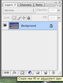
You can go straight to Curves and begin making changes, or a wiser decision would be to create a Curves layer. That way you can continuously make changes or quickly undo the effect by simply deleting or hiding the layer.
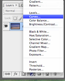
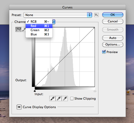
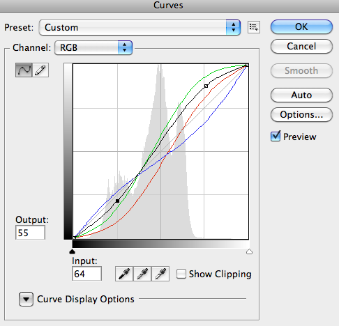
In Curves, we want to firstly adjust the red, green and blue channels individually. To select the single channels, click on the drop down menu that says RGB.
Think Curves, think Strawberry…
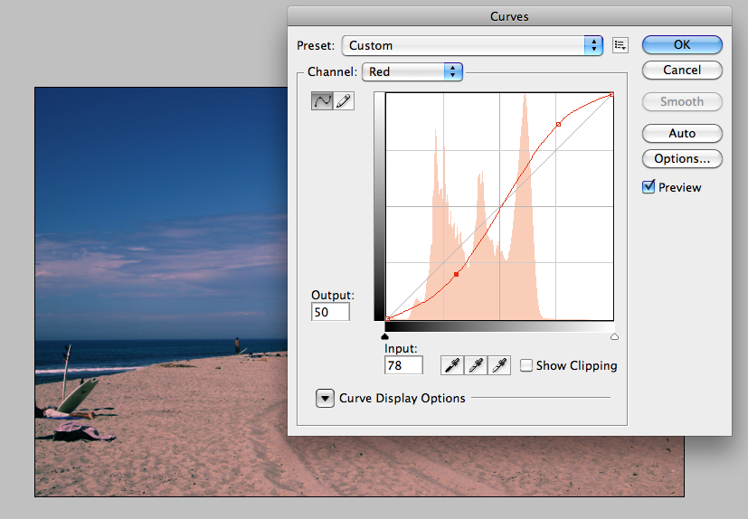
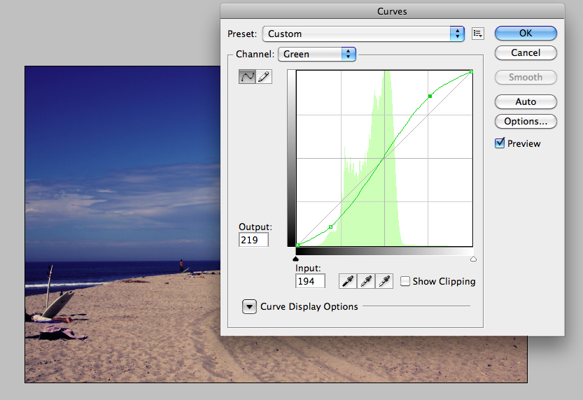
With the red and green channels, we want to increase the highlights and decrease the shadows (like an S-curve).
With the blue channel, we want to do the reverse – so decrease the highlights and increase the shadows (a reversed S-curve)
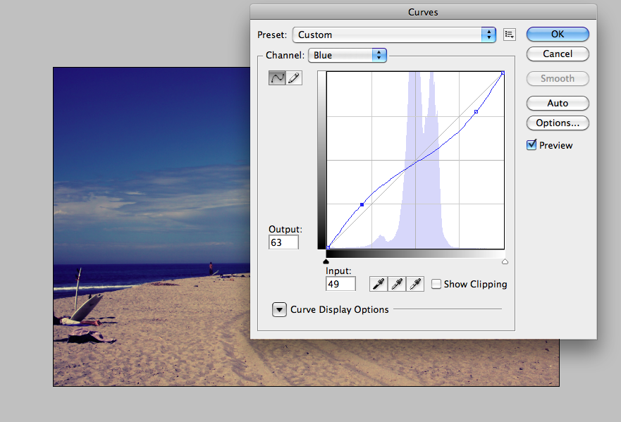
To help me remember what to increase and decrease, I would think of a strawberry. A strawberry has the colors green and red and starts with an ‘S’. Thus, those two colors follow the S-curve whilst the color blue would be reversed.
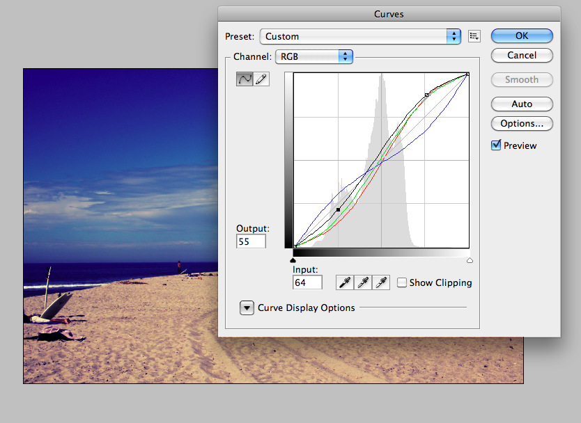
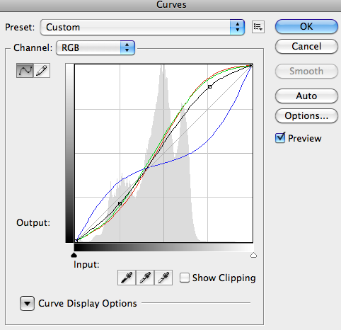
Also adjust the RGB channel if you want a bit more contrast. So increase the highlights and decrease the shadows (S-curve again). Be subtle about this, unless you’re purposely going for an over-the-top look.
A photo with more vibrant colors in minutes
Once you’re happy with the curves, you can really just leave it as it is. Or, you can go one step further by increasing the Saturation levels, just don’t over-do it. Here’s the finished picture:
As mentioned, there’s no right or wrong when it comes to applying the cross processing effect. Experiment and have fun with it! Here are some other variations I came up with:
Version 2

Version 3

Show us what you’ve come up with by posting a comment below.