
Once you have taken your photograph off your camera, it may often be necessary to do some post production work to clean up the shot. It may need more contrast or the colors may be off in the RAW format. This can be done easily in Photoshop once you know some tricks that you can do again and again.
Working with digital photographs can often lead to relying too much on the computer and overusing the tools. Photographs can be overworked in computer software and will greatly impact the quality of the shot. I will show you how some very simple adjustments to your shots can bring the picture to life. I will also show a couple of pitfalls to avoid when working in post production with your photographs. The examples have been made extreme in their overworking to show you clearly how they can ruin an otherwise nice photo. But, with more experience, simple adjustments can be made with the tools.
©Elizabeth Anderson, 2010 www.design-flip.com
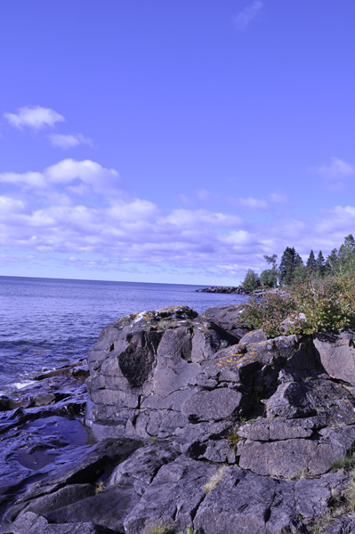
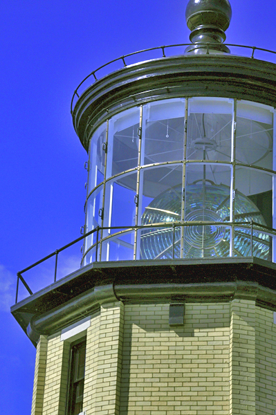
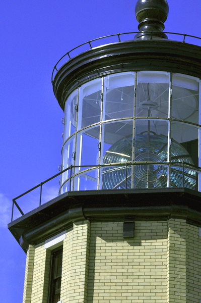
This is a shot I took of Lake Superior and the way it appears straight from the camera. Obviously, the colors are on the red side and the overall look is a little flat. One of the tools you can use to adjust this in Photoshop is to play with the hue and saturation. The hue can bring the whole color range from one side of the color wheel to the other and the saturation can add some punch to the picture overall. It will make the colors brighter and stronger. This is a trick that can be overdone quickly. Here is an example of how both the hue and saturation have been overworked in the photograph.
©Elizabeth Anderson, 2010 www.design-flip.com
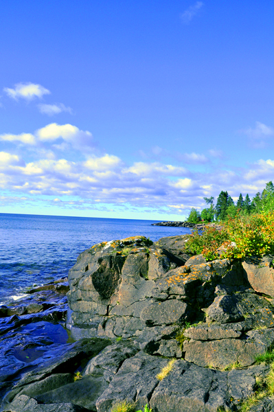
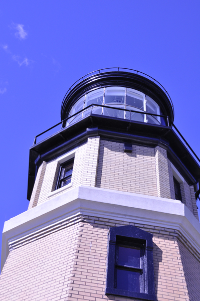
As you can see, the hue and saturation levels have been taken to the extreme. The photograph now has been taken into another extreme color zone and with the saturation being so high, the subject matter becomes even more flat and looks very digital and almost pixelated. The look is overall not accurate, especially with the color. Be very careful when using the hue/saturation tool and only make slight adjustments on most photographs. Because it is a tool of the computer, you need to have the sharp eye to make sure the digital effects do not go too far. Here is an example of how the tool can be used in a simple way to make the colors and depth more accurate. The level in Photoshop were adjusted back and forth slightly until what I saw was what I remember seeing from the day I took the shot. But overall, the numbers did not go up or below 10 or -10.
©Elizabeth Anderson, 2010 www.design-flip.com
The other tool in Photoshop that can be helpful for adjusting your shots is playing with the highlights and shadows. This can adjust a shot that may be in low light or has been overexposed. It will help you bring balance to the shot and bring out details that may otherwise be lost. Below is a shot straight from the camera.
©Elizabeth Anderson, 2010 www.design-flip.com
The shot is very dark and lack some clarity in the dark parts of the shot. The details are being lost. Here is the same shot when I have made the adjustments to the highlights and shadows.
©Elizabeth Anderson, 2010 www.design-flip.com
Some of the detail in the shot has been regained and overall the lightness is improved making the colors and lighting seem more accurate. But, it has also created a short of halo around certain parts of the subject. This is the effect of Photoshop and the pixels in the digital format of the photograph between darks and lights. The objects have also been flattened and some of the pixels in the shot are becoming too obvious. I find that adjusting the highlights and shadows works best when done in moderation and when there is obvious over or under exposure that has taken place. Here is the same shot when this tool is used with a careful eye.
©Elizabeth Anderson, 2010 www.design-flip.com
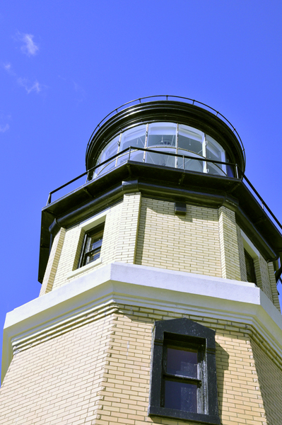
The third tool you can use is to adjust the levels of a shot. This will let you adjust the darks, lights and mid-tones in a shot. You can help balance out the photograph and add blacks and whites where they might not appear in the original. Here is the shot before any work has been done.
©Elizabeth Anderson, 2010 www.design-flip.com
The shot is a little overexposed and the dark locations have lost their detail. Here is the same shot when the levels have been taken to the extreme.
©Elizabeth Anderson, 2010 www.design-flip.com
Again, when this is overworked, the pixels become much more prevalent. The depth has also been flattened somewhat and even more detail has been lost. Especially many of the mid-tones have been lost which makes the contrast too high. Here is the same shot when the levels have been adjusted with a sharper eye and with more care for how it can affect the shot overall.
©Elizabeth Anderson, 2010 www.design-flip.com
Now, the mid-tones are an important part of the piece feeling balanced and the dark spots have gained some of their detail back. Overall, the architecture has depth and a reference within its space.
The final Photoshop tool I will discuss is brightness/contrast. This will increase or decrease not only the differences between your whites and blacks but overall lighten, or darken a shot. Here is a black and white photo that is a little flat and lacks a lot of vibrant contrast. The grays are taking over the whites and blacks.
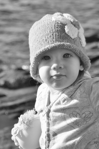
©Elizabeth Anderson, 2010 www.design-flip.com
Pay careful attention to the little girl’s eyes and how adjusting the contrast can eliminate detail. This is the greatest danger in using this tool. The detail can be lost and the contrast can overtake the clarity of the shot.
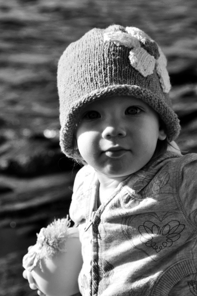
©Elizabeth Anderson, 2010 www.design-flip.com
The sparkle in her eyes is almost completely gone and now the mid-tones have been overtaken by the extreme blacks and whites. This has also affected the background, making it too dark in relation to the subject in the foreground. This flattens the shot as well. Changing the contrast and adjusting the overall lightness/darkness can be a great tool to make shots sharp and interesting. But, when the photograph is overworked in this way, the clarity is diminished, especially when shooting a person with curves and small details.
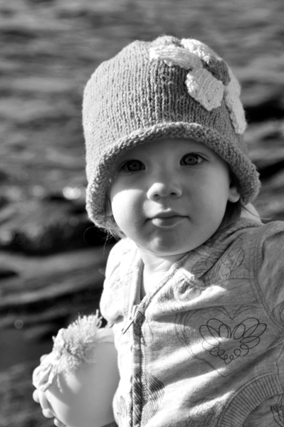
©Elizabeth Anderson, 2010 www.design-flip.com
When doing post-production work on your photographs, the number one piece of advice I can give is to sharpen your eye and look at the shot several times and compare it to others taken on the same day. Be mindful of how much you are doing in Photoshop to make your shots perfect because they can be overworked quickly. Make small adjustments and then go back and see how they can still be adjusted. Try not to make huge steps of change unless you have tricks that work for you. Simple, small changes may be all you need to do to make that extra pop in your photograph!

