Tips for Shooting in Black and White

September 9, 2010 · 16 comments

in Tips & Tricks

Photographing in black and white is sometimes considered to be the purist form of photography because you rely much more heavily on composition and form than with color shots. You must see the gradients from black to white and consider your subject matter without the distraction of hue vibrancy. Here are a few tips for making sure your black and white shots are the best they can be and what pitfalls to avoid.

1. Composition

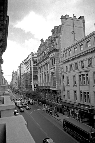
Because many people see black and white photography as the highest level of the art (this is up for debate by many photographers), it may be tempting to avoid considering your composition. It may seem that the contrast will do the work for you and because it is “high art”, the rest will take care of itself. This is by no means true. If anything, the forming and framing of the picture is even more important because the changes between shades and tones is so much greater. You may even consider taking a mediocre color shot and simply convert it to black and white. This is a mistake. Every shot needs careful consideration and you should frame and compose the view as you would in color.

Lamp

©Elizabeth Anderson, 2010 www.design-flip.com

Driftwood

©Elizabeth Anderson, 2010 www.design-flip.com

Consider foreground and background relationships and diagonal lines for increased tension. Always think about the balance between the black and white and where it falls in the space.

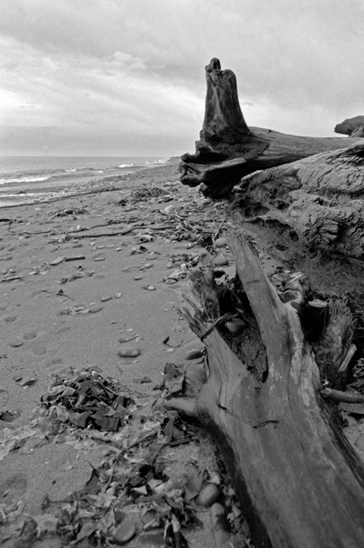
2. You Need Both Black and White

This may seem like an obvious statement for black and white photography, but it can often be overlooked. Do not let the grays take over the whole shot because it will create a very flat image. This is mostly a matter of proper exposure and making sure you are light metering properly. Black in white is in every shot, you just need to capture it with proper lighting. Also consider balancing the black and white. This does not mean making sure the amounts of each are exactly equal but more creating an overall balanced composition with these elements. It can be done both in a very high light situation or a very dark space. It is just a matter of understanding what your camera is capable of exposing. Don’t overcompensate one way or the other. It is OK to have pure black and pure white.

Guthrie Theater

©Elizabeth Anderson, 2010 www.design-flip.com

Machinery

©Elizabeth Anderson, 2010 www.design-flip.com

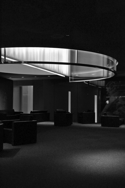
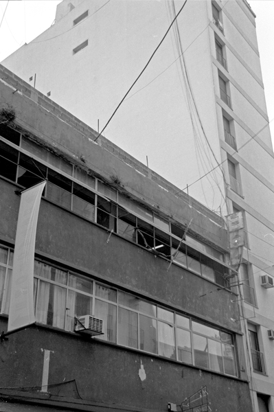
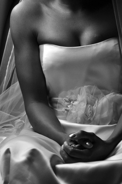
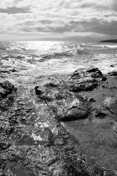
3. A Wide Range of Grays

Having both black and white in a shot is important but just as important is to have a wide gradient of grays on the scale. This will add the depth and added vibrancy to your shots. Catching these grays are again a matter of proper exposure and making sure you do not wash out the grays with too much white. Often the sky is a great place to catch these grays and they will literally gradate from top to bottom which is perfect framing for your shot. Look for your possible middle gray and then expose the surrounding elements based on that exposure. The grays are especially important to capture the proper tone in skin and the rounded form of bodies and faces.

Bride

©Elizabeth Anderson, 2010 www.design-flip.com

Singers

©Elizabeth Anderson, 2010 www.design-flip.com

4. Proper Exposure

As already mentioned above, proper exposure is key, especially in black and white shots, to creating the best shot possible. Each shot should have pure black and pure white. Each shot should also be different in its range of tones; they do not all have to be the same level of lightness or darkness. Some will be much darker and some will be much lighter overall. The proper exposure is what makes each shot accurate and unique in capturing when they were taken and under what circumstance. Get comfortable with setting the ISO on your camera as the lighting changes to get the best light meter you can. Expose on middle gray so you can understand the high and low end of the lighting in your composition. Learn to understand the relationship between your aperture and shutter speed so you do not have shots coming out over or under exposed. In black and white photography, you often need to be much more sensitive to the lighting because of the smaller range of saturation that is possible.

Lake Superior

©Elizabeth Anderson, 2010 www.design-flip.com

Tiger

©Elizabeth Anderson, 2010 www.design-flip.com

5. Do Not Covert Your Shots to Black and White in Photoshop

This may seem like the simplest and most obvious way to change any shot you want into a black and white composition. For many photographers, this can lead to mistakes and overall duller and photographs with less contrast and vibrancy. The camera has taken the exposure into account based on the ranges possible within black and white. Photoshop is less sophisticated in its understanding of this range with the simple conversion tools it has and will flatten a lot of the depth you have captured in the shot. The conversion from one to the other is not 100%. If you have a more complex software that came with your camera, this will allow you to manipulate the shots much more carefully. Never use the computer as your main tool for creating your photographs.

Building

©Elizabeth Anderson, 2010 www.design-flip.com

Buenos Aires

©Elizabeth Anderson, 2010 www.design-flip.com

Article by

Elizabeth has written 21 awesome articles for us at Photoble

  • http://twitter.com/publikaccion publikaccion

    I have to disagree with point 5… Camera RAW gives you more control for conversion as Photoshop is a plugin for Camera RAW 😉

  • http://twitter.com/publikaccion publikaccion

    I have to disagree with point 5… Camera RAW gives you more control for conversion as Photoshop is a plugin for Camera RAW 😉

  • http://www.twitter.com/yiiee Yiie

    Great article on b&w as always Elizabeth. However, I’d have to say not to use the built-in black & white mode on your camera as that often gives you duller and flatter images. I agree with publikaccion that for more control and flexibility, it’s probably better to shoot in RAW. Photoshop is sophisticated enough to convert color photos into b&w, but agree that involves more than just clicking the ‘desaturate’ button.

  • http://www.twitter.com/yiiee Yi

    Great article on b&w as always Elizabeth. However, I’d have to say not to use the built-in black & white mode on your camera as that often gives you duller and flatter images. I agree with publikaccion that for more control and flexibility, it’s probably better to shoot in RAW. Photoshop is sophisticated enough to convert color photos into b&w, but agree that involves more than just clicking the ‘desaturate’ button.

  • Elizabeth

    Thanks for the comments. I think it may depend on your camera as well. I have heard both points of view. If your camera comes with some conversion programs, then I think it works. I have had much better luck on my end doing it this way, but everyone should explore their own equipment. Go with what works for your shots!

  • Pingback: #1 Way To Lose Weight | Xtreme Fat Loss Diet Reviewed

  • http://www.mobilecubix.com iPhone App Developer

    It is Good new tutorial for me …first i practice that tutorial and then give another comments

  • 6C6F7665736F6E31

    I like your black ans white comparison in this tutorial.I hope u include more pictures with black and white tutorial
    http://www.neobux.com/?rh=6C6F7665736F6E31

  • 6C6F7665736F6E31

    I like your black ans white comparison in this tutorial.I hope u include more pictures with black and white tutorial
    http://www.neobux.com/?rh=6C6F7665736F6E31

  • GroovyDoodle

    I’m not sure I agree with the tip about never using PhotoShop to convert. Of course, I wouldn’t just convert and leave it. There are other adjustments we make as well to have nice b&w high contrast images, but I feel I have much more flexibility within PhotoShop than I have within my Nikon D300.

  • Pingback: Bookmarks for September 15th through September 27th | dekay.org

  • http://www.bigsunphotography.com Big Sun

    I would expect that shooting RAW up front has to be the best option as you are losing no information. All other options will reduce your information and post options.

    I do agree though that PS’s and LR’s black and white conversion is somewhat lack luster. I recommend using Nik Silver Effects. It wins hands down over PS/LR conversion.

    Just shot these B&W yesterday: http://www.bigsunphotography.com/archives/1530

  • Tashajade09

    I dont agree with not using photoshop for converting image. I think converted images look better than shooting an image in black and white. Also if you dont like it you can always reset and start over. You have more flexibility and looks better. Plus you can use that image in both color and black and white as much as you need. Once you shoot in black and white the color is gone forever and you cant get in back so i think shooting in color is way better than black and white.

  • Ken

    I used to be in a position where I would disagree with you on the conversion but now I finally see the light (pun almost intended).

    The key to the perfect monochrome lies in exposure and not post-processing (usually by stretching the black and highlight values, most often resulting in clipping). I can see your images manage to ahieve deep blacks and unclipped highlights while sacrificing no necessary detail: the photos look wholesome.

    Before I would be awed by a contrasty-pic: one probably done quickly in post and with the sole objective to woo at first sight. Now I come to appreciate the subtle beauty found in “real” monochrome.

    I’m still far from achieving any reasonably good result, but at least I understand.

    Thanks for the article and for the lovely photographs.

Previous post:

Next post: